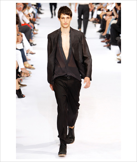
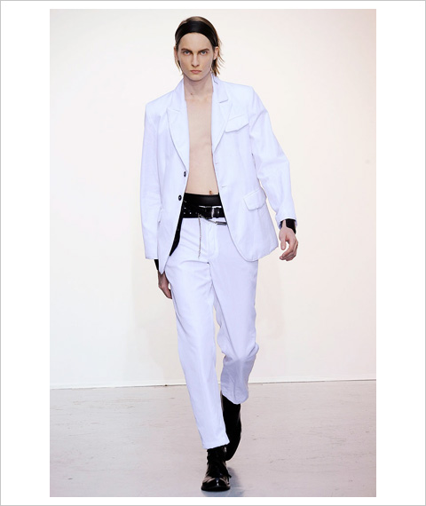
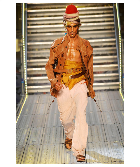
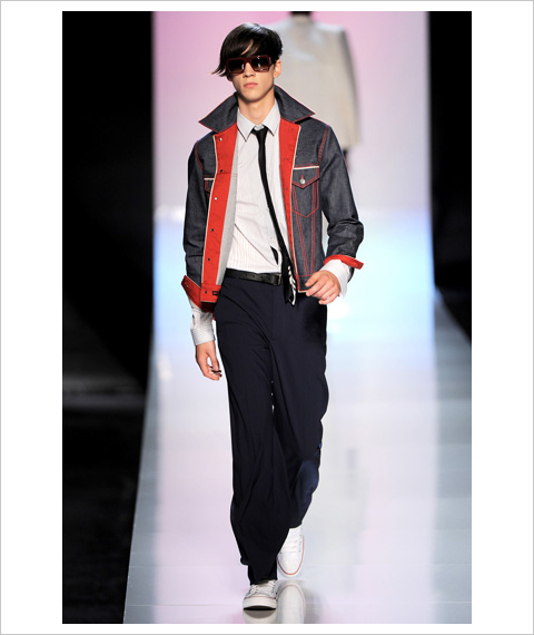
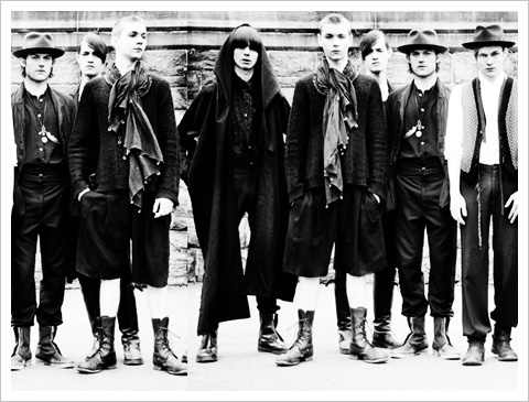
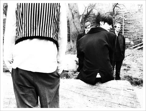
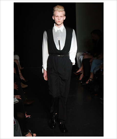
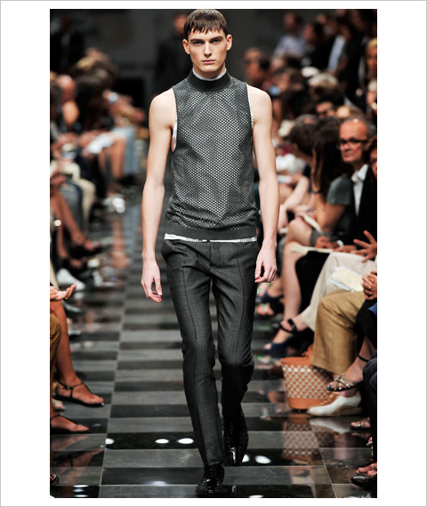
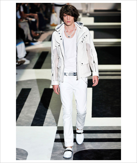
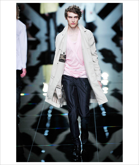
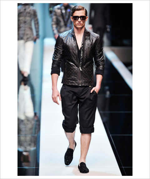
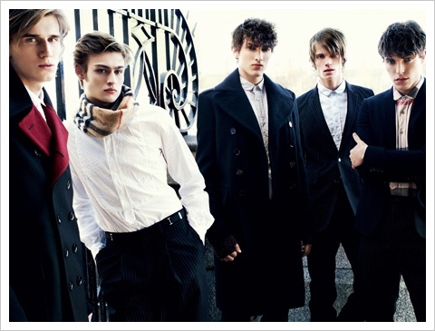
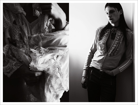
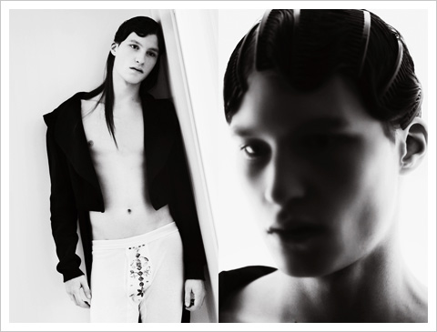
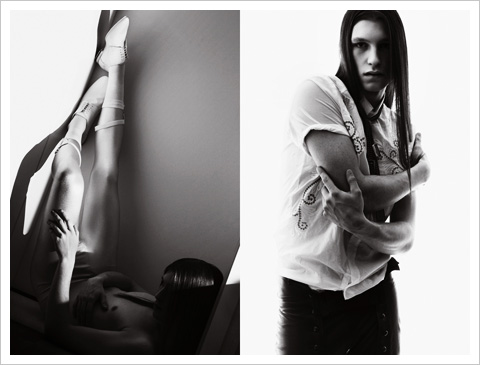
Kris Van AsscheによるDior homme 10SS Collectionのテーマは、"Cold Love"。
超軽量のテイラーリングによるトレンスペアレンシーなレイヤードを展開し、Dior hommeの持つ都市的な雰囲気の中に民族調のリズムをミックスしたのが今回のコレクションなのかなと思います。Ethnically City Street Styleとでも表現しましょうか。ファブリックとパターンとカット、そしてその合わせ方(レイヤード等)というそれぞれの属性に対して、それぞれ違ったアプローチをするというアイデアがベースにあるような気がしました。
ファブリックで遊ぶというとRaf Simons(Jil Sander)が頭に浮かぶのですが、このベクトルに行くのがKris Van Asscheのクリエイションらしいなと思いましたね。ただ、ビジネス的には結構厳しくなりそうな気がして、少し心配になってしまいましたが。。
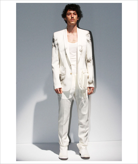
Maison Martin Margielaの10SS Men's Collectionはブランド・アイデンティティーであるホワイトを基調に、フラワー・モチーフを点在させるというアイデアで展開。全体的にティピカルなMaison Martin Margielaのコレクションだったかなと思いますが、men.style.comのレビューにあった、
if the original personality of the house was formed by a marriage of modesty and ingenious craft, the spirit lingered on this collection's floral theme.
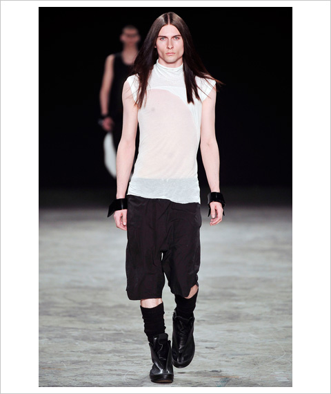
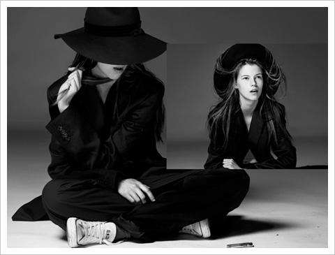
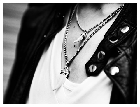
Ann Demeulemeesterの10SS Men's Collectionは、憂鬱な世界観から少し離れ、その世界には光と柔らかさがありましたね。カラーパレットは白と黒を基本として、ベージュなどの淡いトーンでまとめられていました。
ランウェイではシャツを着ていないLookが大半で、スパンコール付きのカーディガン、カマーバンド、09-10AWのレディスでも見られたレザー・コルセットのようなアイデアもありつつ、シルク・ローブはボクサーのようでもあり着物のようでもありました。
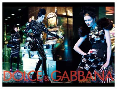
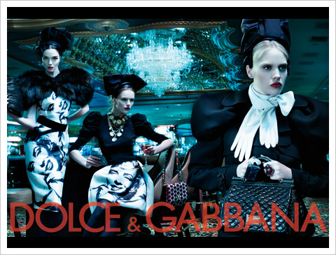
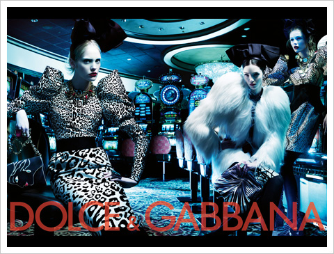
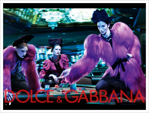
素肌にジャケットだとMaison Martin Margielaっぽく見えたり、シルク・ローブはDolce & Gabbanaっぽいアイデアですが、アンのクリエイションはポエティックでシャープな印象を受けますね。今回のコレクションは、退廃的な世界観における「しばしの休息」といった感じなのかなと思いましたが。
Ann Demeulemeesterのブランド・アイコンである羽のように、強さと弱さが同居している雰囲気が素晴らしいと改めて思ったコレクションでしたね。
川久保玲によるComme des Garcons Homme Plus 10SS Collection.
コレクションのテーマは、"Random Collage"ということで、タータン、アフリカン・プリント、ノーティカル・ストライプといったパターンやネクタイのコラージュ、パッチワークがランウェイには展開されていましたね。
tFSで"Beautiful mess"という感想があったのですが、「美しい混乱」というのは川久保玲のクリエイションを上手く表した言葉だと思いました。
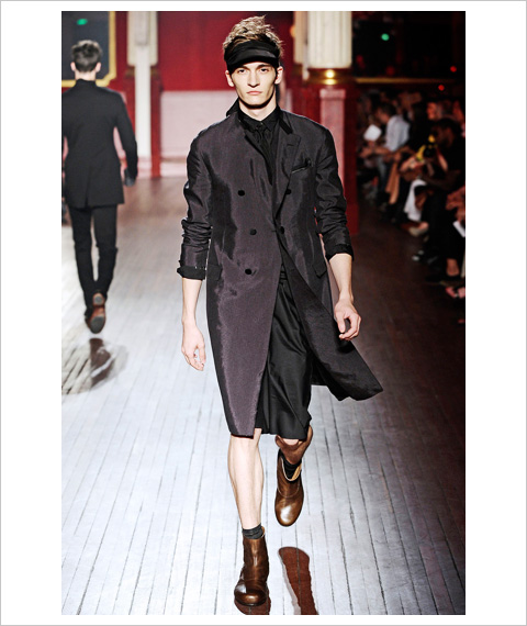
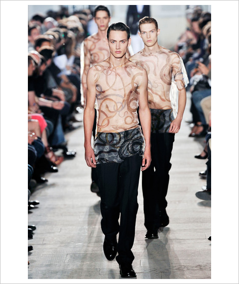
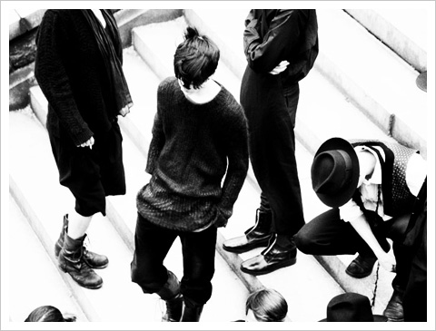
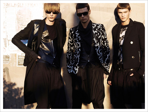
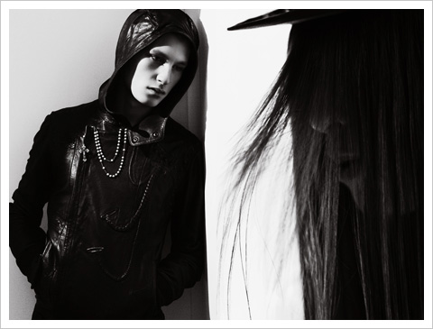
"Dissonance(不調和)"をテーマに展開されたKris Van Asscheの10SS Men's Collection. AP通信の記事などによれば、モロッコやペルーからインスピレーションを受けたとのことで"It's all about mixity,"というKris Van Asscheの発言が載っていました。
Jean Paul Gaultierの10SS Men's Collectionはオレンジをランウェイの差し色に、スカートや首に巻いたスカーフ、チューブトップLookが飛び出す等、かなり自由な雰囲気でしたね。
個人的にはあまりにもレディスのママ過ぎて、少しやり過ぎ感を感じてしまいましたが・・。
ちなみにデニムに関してはLevi'sとのコラボとのことです。
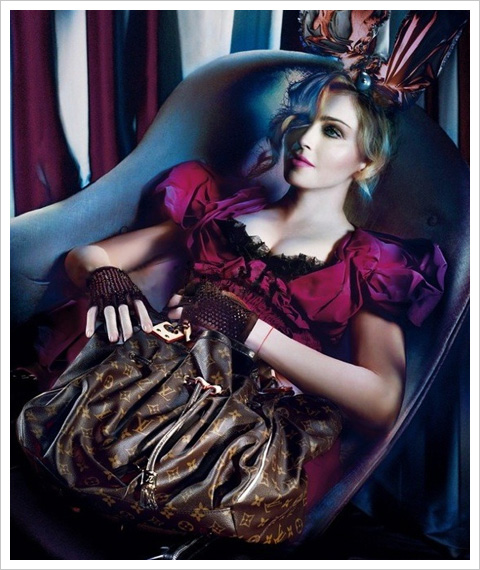
以前から話題になっていたLouis Vuittonの09-10AW Ad Campaignですが、MadonnaとSteven Meiselによる第二ラウンドのイメージがアンオフィシャルにリークされていますね。Kris Van Asscheの例の件もそうですが、今の時代に情報管理は中々難しいようです・・。
tFS等ではPhotoshopによる加工に関する話題が多く提出されていましたが、個人的に目が留まったのは"Wicked Alice in Wonderland"という言葉。HDR撮影のような今回のイメージの世界観を上手く表しているかなと思いました(まだ一枚だけしかイメージを見ていませんが)。
ちなみにAd Campaignに関しては映像もある?とのことですが、もしそれが撮影風景のようなムービーのことでないとすればその辺も期待して待ちたいですね。
Christopher BaileyによるBurberry Prorsum 10SS Men's Collection.
コレクションのテーマは、「天候(の変化)」にあるようで09SSのコレクション(特にレディスでしょうか)とインスピレーション・ソースは近いですね。ただ一つだけ違うのは、優しい憂鬱な世界観に少しばかりの柔らかい光が射していたということ。
Reutersの記事に掲載されていた、"I wanted to start the show with rain and end with sunshine. I think it's a nice analogy of what the whole world is going through as well,"というChristopher Baileyの発言にあるように、重めのカラーパレットの前半と後半に登場するとても柔らかい印象のパステルカラーはとても対照的でしたね。
シャツやニットにあしらわれた(トレンチっぽい?)ベルトやスポーツウェア的な雰囲気のアウターやボトム、チェルシーブーツやレザーのリュックサックも個人的には気になったコレクションでした。
"We are in the midst of a revolution in fashion imagery," Knight asserted. "Moving away from illustration and stills photography, we are now entering the restless world of interactive, self-created, digital-imaging: accessible, downloadable and constantly changing. This is what interests me. Working with the very top fashion creators, this show will open up the whole process of fashion to literally everyone, instead of just an informed few."
サイズ・ゼロ-モデル問題に関して英国メディアが、Alexandra Shulman(editor of the British Vogue)が主要なファッション・ハウスに宛てた手紙を引いて報じていますね。
手紙の内容に関しては、雑誌の撮影に使用するサンプル品のサイズがとても小さく、撮影に起用するモデルは必然的に痩せ細ったモデルになってしまう、といったことのようです。また、Vogue誌の写真についてもモデルが健康的に見えるように(痩せ過ぎて見えないように)修正しているという話やフォトグラファーにもそういった依頼を出しているという話も合わせて載っていました。
Wallpaperの7月号は、"The Sex & Art Issue"ということでNick Knightの写真が掲載されているようですね。フューチャーしたモデルは、Mariacarla BosconoとAlana Zimmer。SHOWstudioでもプロジェクトのページがあり、撮影のハイライト映像やエディトリアルの写真を見ることができました。
Chanel came here for the first time in 1919 with Misia Sert and her husband. They introduced her to Diaghilev, Stravinsky, and all those people.
I always like it in Venice. I also like the melancholic idea. This was the most trendy beach in Europe. Everyone wanted to go to Venice, it was magical. 19th century already, and mostly in the early 20th century. It became less trendy after Saint-Tropez. But the magic touch of Venice was something I could use for this collection, which is inventoried under the name Cruise. I like it, it is redone and impeccable. There is a future done with a large element of the past.
The big black capes are in toweling, inspired by the black cloaks you see in Tiepolo's paintings.
Death in Venice was because I wanted to show Tatjana with the children. It had a melancholy charm. After that, the allusions and illusions I evoked are all fairly vague. "White telephone" movies, the silent Italian movies of Lyda Borelli and Bertini, the colors of Renaissance paintings and even before. The graphic effects of Carpaccio, touches of Fortuny but done differently. There's Byzantium influence, since from 12th century it inspired Venice. There is futurism, D'Annunzio. There is also a touch of pre-WWI French influence on Venice. Henri de Regnier... Misia Sert brought Chanel into the cafe society. People rented palaces here, like Cole Porter and his wife, and the Princess de Polignac. It was an intense life which does not exist today. But I like idea. That is already quite a few references. But no references is carried through to a reconstruction. They are allusions.
They are important for Chanel. Chanel has such a strong image for handbags and jewelry, a stronger identity than any other House. It is fun to play with that. Then there were shoes like gondolas. I like the idea of a little joke, a little fantasy.
Life is hard for many people, so it is nice to propose something playful and at the same time elegant. They are clothes for easy living. You make collections for people to wear. Not for museums, despite a tendency today to design directly for the museum. I am not an artist, I am a dressmaker.
They make beautiful men's clothes. I never wear my own designs.
I love walking in Venice, but I prefer to stay in the Lido. I love the Lido. Not necessarily the sea, I did not have time to swim. It is comfortable, and I have always found it quite mysterious. The references are different, more sophisticated, more literary. That is what I love.
Louis Vuittonと村上隆による"Superflat First Love"の映像が公開されていました。1作目のSUPERFLAT MONOGRAMとは違ってキャラクターが3DCGになっていますね。個人的にはSUPERFLAT MONOGRAMのようにつくりこんだ映像が見たかったかな・・といった感じではあります。
村上隆といえば、"VOGUE NIPPON and Comme des Garcons MAGAZINE ALIVE"でもマンガをテーマにした作品展示が行われていますね。先日足を運んでみたのですが、2Fがすごいことになっていたのが印象的でした。
SUZY MENKESによる川久保玲のインタビュー記事。COMME des GARCONSは今年で40th Anniversaryなのですよね。"I start every collection with one word,"といった話など、面白いのでお時間のあるときにでも読まれることをオススメします。